The new careers section of the website was re-designed in response to pain points discovered during performance analysis and the need for overall aesthetic improvement. All content on the page was created to reflect and communicate Kennards Hire’s values and work environment effectively, positively impacting recruitment and hiring metrics.
01
Analyse and measure current state performance usability issues and significant pain points.
02
Consider current brand guidelines and competitor solutions.
03
Develop wireframes utilising current content and create new content based off of user and business needs.
04
Define final designs, pushing to development, and monitoring performance overtime.
Page analytics and user behaviour analysis outlined any usability issues or pain-points that could be improved, as well as any design inconsistencies or opportunities for the new page. Insights from these user interactions and frustrations, as well as from the design evaluation of the page, resulted in the following opportunities:
Following brand guidelines was key when considering how Kennards Hire produces a distinction in the marketplace against competitors, as well as giving the brand it’s personality. Competitors and innovators were also looked at to find design inspiration and to gain an understanding of how their brand and messaging was adapted to suit their ideal candidates.
A current and future state interaction model was mapped out to help map all page elements and user interactions before jumping into wireframing. The original four pages were condensed into one succinct page with all relevant information.
I used the interaction model as a guide during wireframing. A key takeaway after feedback was moving employee benefits closer to the top of the page for higher visibility and to pair well with Kennards Hire values.
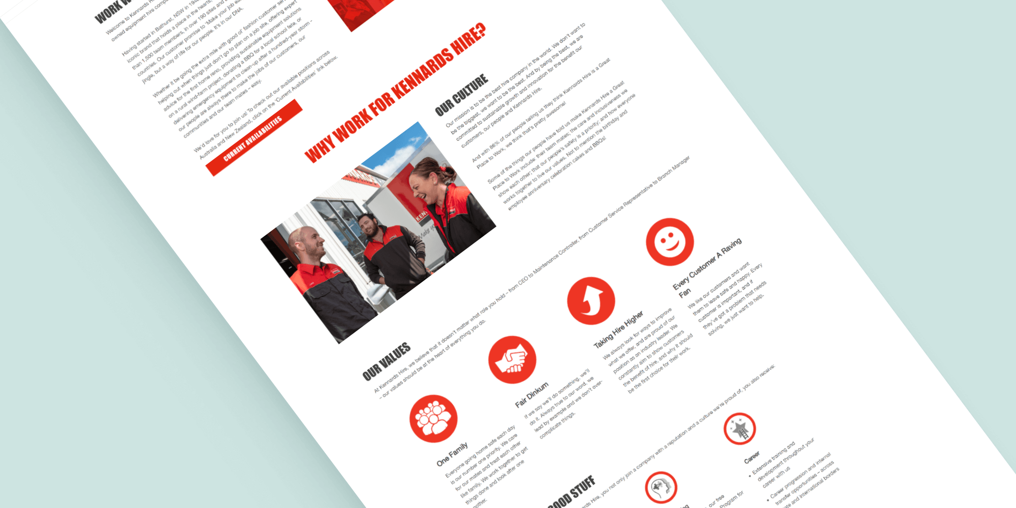
Continuing in Figma high-fidelity designs were built based off of the previous wireframes. All user pain and frustration points were sought to be answered by this final design.
The final result: clear visual and information hierarchy adhering to both business and user needs, imagery and iconography that reflected and communicated brand values effectively, and a positive overall experience.
Once the design was complete the appropriate assets were handed over for development. UAT was performed by myself where small changes were made to fit the design high fidelity design.
This new redesign has positively impacted page views and SEO, user engagement, and improvement in hiring metrics.
I'm currently taking on freelance work and career change opportunities within UX/UI design. Feel free to email me or message me on LinkedIn as I'm always up for a chat.